Friday, December 11, 2009

Guilford, CT


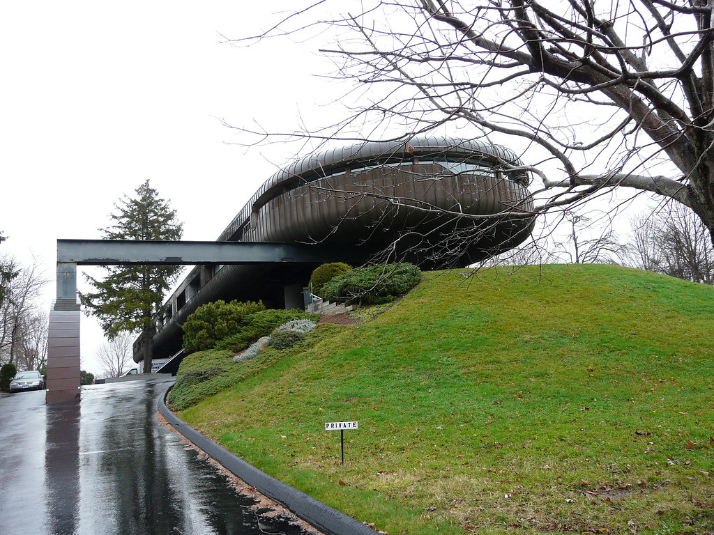
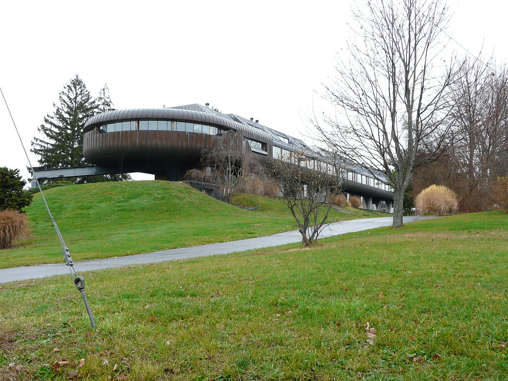
Yes, it's multi-family housing, seriously! It's an apartment complex in Guilford, Conn (condos, but, really, that is just the ownership form of apartments). It was recently featured in the Times and when I had the chance to take a quick look at it, I did!


The most interesting thing to me about these is that they are really a lead brick in (mostly) colonial Guilford. They were designed by Wilfred Armster and built in 1984. It reminds me a lot of the work (architecture, that is) of Bart Prince (protege of Bruce Goff) in many ways, but with a more rugged aspect and slightly more refined construction type and detailing - much more solid appearing.

Here's the link, just for fun.

http://www.nytimes.com/2009/08/13/garden/13who.html?scp=1&sq=guilford&st=cse

Dry Spell

Sorry for the dry spell; my computers have crashed and I lost of lot of photographs, however, I have been uploading the photo's which I was able to save to Flickr and have some new (and exciting) ones for you, to upload and post about....

So to get us started off, my flickr link;

http://www.flickr.com/photos/30052777@N07/sets/

Wednesday, September 23, 2009

Chicago or Vancouver?

One could almost be forgiven for thinking that this view might be the West End of Vancouver, except for the semi-decrepit Lake Shore Drive bridge and viaduct and the detritus of the Spire site.

You have, from right, the DeStefano tower along the river, Jeanne Gang's Aqua nestled into the shadow of the Standard Oil Building (unfortunately, reclad in boring white granite, not happy red anodized aluminum), the various New East Side buildings of the New East Side, mostly by SCB (Solomon Cordwell Buenz), the BCBS building by Lohan Associates et al, a peak of 340 on the park (the best of the newer bunch) and the older buildings, most fun of the lot being Outer Drive East, with it's spa and holidome. Harbor Point is furthest to the left, which is also a SCB design of the early 70's (from 1975 in fact) with a gaggle of 80's high rises around it.

Friday, August 21, 2009

Lake Meadows

Well, I'm just chock full of posts this month (and week even, in fact). But I just had to post this. This morning I had a great opportunity, the chance to go up on a south side rooftop. So here are the results.As those of you who are intrepid might guess, this was taken from a Lake Meadows rooftop, from the Luxury Building no less (that would be the smaller building closer to Lake Shore Drive, which is the only building which is not rental, has central air conditioning, inset balconies and in addition, a bigger unit mix - i.e. larger units).

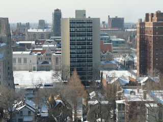
Here you can see some of the mix of buildings on the near south side. The distant buildings are the towers of Indian Village - the area of East Hyde Park and Kenwood which was to have been a new streeterville or even Manhattan-esque area. In the immediate foreground there are townhouses and a vintage street (aka gated community), a newer mid-rise complex - early 90s if I recall correctly.
Here is the view south, looking at the simplest of the slab buildings, which are the most pure of the zielenbau of Skidmore's plan for LM. Here is a view of the stereotypical curtain-walled glass towers, with the more recent "infill" townhouses in the forground.
Another view, towards the northwest, with more of the townhouses. Quite frankly, they are an abomination, firstly because of the purity and elegance of the scheme - and the luxurious quality of the towers in the park. But also because of the poorly designed pastiche-laden neo-traditionalism. If they had done modernist housing, ala South Commons, the result would have been much more successful. And looking north towards the loop with Prairie Shores (Perkins & Will) to the left and Michael Reese Hospital (Hopefully long for this world) to the right.

As you may, or more likely, may not know, Lake Meadows was built by the New York Life Insurance Company as an investment. It was also slum clearance and necessitated the Robert Taylor Homes along the Dan Ryan, which was built as replacement housing. It was intended as a mixed-race, middle/upper-middle class development, not a project (obviously). In fact, it became a haven for many members of the black elite, who actually paid more rent than the white residents who were subsidized. It is interesting the see the photos of the mixed-race mixed doubles tennis (no, sorry, the couples weren't interracial) - where else would you have seen black tennis players in the 1950s, let alone two couple of different races playing together?

However, the social exclusion of LM and the slightly, but only somewhat, later Prairie Shores, led even Hizzoner Daley Sr, to commission South Commons as a mixed-income and mixed-race complex, that, however, is a discussion for another time and (another) post (one which talks about the change in aesthetic, as well as social aims and goals of that project, sorry, complex, don't want to confuse things).
Protest!

While I usually try to steer clear of political issues with this blog, I found this to be rather amusing, well, more interesting than amusing, as it proves that Chicago is still a labor town. They've been out there a few mornings lately, but since I don't always take the bus, either the el or my bike, I can't say for certain how often.

Thursday, August 20, 2009

Back to Boston

550 Beacon Street

Since we've been visiting New York, I felt we had to go back to Boston to get some of my backlog of posts cleared out of the archives (and believe you me, there are a lot planned, believe me...).

So here we have 330 Beacon Street in the Back Bay, Boston's Back Bay that is. Here in the middle of the posh 19th Century Subdivision (yes, for that is what it is, a subdivision, albeit, tres upscale) lurks an interloper, an interloper of a modernist ilk. It would be Hugh Stubbins' 330 Beacon of 1959. Not only is it discretely fitting itself in with it's red brick and bay windowed facade, but it also make no grand gestures, but simply fits in quietly.

Interestingly, the back facade (the rear faces both the Charles River and an expressway) is glazed and balconied. In fact, in a paraphrased quote, the orientation doesn't matter to Americans as much as the view (and as long as the physical plant can provide comfortable temperatures year round). What struck me when I visited this spring was something that I hadn't realized; that it is red brick and not white brick as I had thought from my trusty "Multi-Story Housing" book. In fact, I shall get more images from that and another book from the era it was built in. I had to cull the floor plans from elsewhere, however... (disclaimer, as a technically inept person and luddite, my computer, pc, wordprocesser or whatever you want to call it, and hence scanner, at home are not working, I am somewhat limited with and in my imaging abilities).

In fact, the building is also quite interesting in plan as well. It has a modified skip stop corridor configuration. Here is the corridor floor, which is every third floor.
There are a few north facing, single sided units, while the rest of the units are through units, with two exposures.
Some of the units are duplexes, and most are quite large. At the core floor, there are three cores with two units per core lobby.

A future post will feature more plans, vintage and interior shots...

Reference:

Key Urban Housing of the Twentieth Century
Plans, Sections and Elevations
Hilary French
W.W. Norton & Co
2008

Wednesday, August 19, 2009

The Legacy....

The Legacy at Millennium Park is one of my favorite of the new crop of residential loop high-rises. I didn't think that I would really like it from the rendering and plans, but...
I find that I do. It is quite elegant and particularly dramatic when viewed from the park with it's 72-story, 800+ foot height subtly tapered form. The reflective glass effectively mirrors the sky and some of the surrounding buildings in the right light.

Tuesday, August 11, 2009

Chatham Towers

Chatham Towers is one of the most interesting middle income developments in urban American from the 1960s. They were built in 1964 as a cooperative near City Hall, next to Chinatown, designed by Kelly & Gruzen. Unusually, they are raw concrete in one of the most purely brutalist complexes in the United States - residential complexes that is. In form they are close to many English social housing schemes, however in detail they far surpass them (being site built for a higher price point helps, of course). Interestingly, they reputedly have Swedish windows - the blinds are between the glass of the double-glazing, which is extremely common in Swedish windows from the 30s until the 80s, as well as being center-pivot windows (also common in Sweden in this era). Apparently, there was some controversy about the use of gypsum board (aka drywall) within the units at the time as well.
Here is a view from an overpass, framed through tree's, showing the assymetrical penthouse. A view of the balconies, showing the detailing, the ribbed concrete and elegant balcony edges and the windows. The slots beneath the windows are for fresh air supply I assume, for the air handlers.
A view looking up at the balconies and facade. The balconies are assymetical in the sense of some floors not having them to create a more interesting silhouette. Another view looking at the buildings obliquely. A shot from the privacy and retaining wall, framed through the garden trees.
A parting glance, looking at the towers in shadow. This shows the balcony silhouette quite well. The concrete is in amazingly good condition, probably due to the less severe New York winters.

I will follow up with plans and further details when I get a chance, however I wanted to get these photos out quickly.

Wednesday, August 5, 2009

Broadway Update

It is called 40 Mercer (at least the upper residential tower portion) and is by noted French Architect, Jean Nouvel.

Broadway Penthouse

Here is the second entry in my flurry of New York postings. In this entry, I was fascinated by this penthouse which I saw as I walked up Broadway. While it's not great architecture, it's site lends itself to a dramatic vista as one walks up Broadway and see's it's position change, to looking at it from above to below. The blue sunshades are also quite arresting, especially from a distance.
The superstructure here is also interesting, harkening back to the early moderns of the Bauhaus era or to a steamship (or for that matter, a dock). Coming closer, one can see that the superstructure actually does include a crane, which is a fantasy for many architects to include in their projects (myself included). Getting still closer, it becomes apparent that the sunshades are indeed, actually blue in color!Closer still, they are transparent as well. One can also see the crystalline glass box sheltering under the brise soleil. Despite nestling beneath that, despite the sunshade, I imagine the solar load on the mechanical system is astronomical. However, as these are obviously luxury apartments, I don't that that is really much of a factor.
Here in a final view, one can see the tower above the base or podium of the building, which sports a less glass box and more "technical" or mechanistic curtain wall (or perhaps it's actually a cladding system). I am going to do some research to find out more information about this building. But for those of you that are intrepid, curbed (http://curbed.com/) is where I am going to start first.

Monday, August 3, 2009

Tudor City

Tudor City in the Rain

Well, once again I realize that I have been truly neglectful of this little project, my blog. In fact, I haven't updated since the very end of May, and I have all of June and July to get written and posted. Since I went to the multi-family capital of America this weekend for a visit and took my trusty little camera with me, you, my dear readers, can have some visual treats.

Tudor City

First off we have Tudor City, once owned by Husband to the Diva, Harry Helmsley, who got into quite a bit of trouble trying to redevelop it before selling. I'll update with further information, but briefly, it was built in the 1920s, on the eastern edge of Midtown Manhattan. It is literally directly across the street from the UN (as in United Nations) however, when it was designed, there was no Congress of Nations or other body on that site (well, bodies, not the governmental kind, or even human, but the edible kind) just docks and stockyards, hence the inward facing design.

It was quite a lovely space, with a large garden with tall, mature tree's making the Neo-Gothic (Tudorbethan or Jacobethan) towers all the more surreal when seen through the leafy canopy. At ground level the arboreal splender appears to be a modestly scaled, nicely detailed space, however the penthouse levels above do make a dramatic impression when viewed from below in typical Manhattan fashion (nearly all of my photos were in portrait mode from the verticality of it all - at least Lower Manhattan and Midtown.
Another shot looking upwards. The tops of the buildings are really magnificent against the cloudy sky with rain pouring down. A view of the central courtyard, more of a garden than a park. The undeveloped area was a big bone of contention when H. Helmsley owned Tudor City.
A parting glance. The last shot shows one of the more modest building tops.

Friday, May 29, 2009

It's happened again...


Once again, I'm behind on posting. Hopefully I can rectify this situation soon, but the meantime and meanwhile, a little something to tide you over...

How about this preview of an upcoming post about a modern masterpiece...

Wednesday, April 22, 2009

Some Art Deco Gems

Well, today we'll go back in time a bit from yesterday's posting and take a look at some of Chicago's art deco heritage. Our first example is from Edgewater Beach, which, unfortunately, didn't photograph well, due to the quite large trees out front. In front, however, you can see the unique reverse arched windows, which I have never seen before in this vintage in Chicago. To the left, the building next door also has a deco flavor, albeit one inspired by prairie and gothic verticality.
Our next example is from the gold coast, and represents what I see as more of a typical - even traditional deco (really more modern, due to lack of ornamentation) townhouse form but in a three-flat. Interestingly, it mimics in scale the older house to the right, which indicates that it might have been a remodel - a dreaded facadectomy even. But a full renovation is more likely. Here we have a rather interesting small apartment building from Lake View. This one is quite ornamented, with a rather unique rusticated stone trim, but at the base and the two center columns. This is paired against the sleek silver metal and glass block entry and the horizontally divided lites in the windows. If you were to peek around the side you would see metal casements along the sides and rear of the building as well. Our last two examples are in Rogers Park - West Rogers Park (or West Ridge if you prefer) along the "Farwell Corridor" as I've dubbed it. I've called it this because of the fine examples of large and grand apartment buildings there. These two large six-flats have wonderful decoation on their blond and yellow-blonde facades. The second one, in particual, has wonderful stonework with a florid deco influence. The interior of this building also, apparently, features much Hollywood Deco inspired detailing, such as doorways and plasterwork.

Even though Chicago really isn't a deco stronghold, we do have some nice, very nice in fact, examples, even among our vernacular housing stock.

Tuesday, April 21, 2009

Some Midcentury Fun

Some mid-century fun for the mid week. Here are some of our more mid-century kitsch buildings.
First off we have the fantastic "murals" at.... the home of the eternal flame... home of the stained glass (ala Brady Residence stairs) graced mail rooms..... Chinese Village shod courtyard.... yes, oh yes. Why, of course it is, it's...Imperial Towers. These two shots only show some of it's charm(s). Not to mention the incredible "I Dream of Jeannie" style worm wood paneling and kitchen screens which original condition units still have.
Next we have a canopy (one of a series) at Sandburg Village, which shows some of it's age with it's butterfly construction, as well as some corrosion staining....
And lastly, a nearly matching canopy with sculpture at 555 W. Cornelia. More on this building and it's ilk in the future, I should think, since I have some theories about it's design, in relation to other buildings here and a possible antecedent to these. The precedent will be a lot of fun once I get it posted, I promise.

Thursday, April 9, 2009

Cambridge, Mass

Well, as you can see, I've just be off gallivanting across the eastern seaboard with a little jaunt to the Boston area, which is both rife with vernacular apartment buildings and rich with very interesting, and elegant, examples as well.

Here we have the first entry in the series, with an example from Cambridge, Massachusetts (home of, well, you know what University). The Boston area is known especially for it's "Triple Deckers" aka a three-flat in our parlance. However, in this case it is a masonry building with grand pretensions, with yellow brick and limestone on the street elevation and red brick on the sides - none of our Chicago common brick here, one notices. It also sports a massive copper cornice and features copper bays on the opposite side from the courtyard.

Interestingly, I noticed few masonry three story apartment buildings, but many four and five story buildings - all in masonry, of course. As an aside, one can go much taller with wood frame construction, but that side note wasn't the case in the 19th Century with it's fire regulations (which often keep to much the same rules and regulations today). In this case we have five stories, with what appear to be many small flats within.

The building, this building in particular was alone, has similarities to buildings along the street as well as to similar sized buildings in central Boston as well. We also have rich beaux-arts detailing around the entry and in the previously mentioned cornice.

Nicely for the observer, the building to the right has been demolished, allowing a side view of the "courtyard" with it's bay window and fire escape. The windows of which have been nicely trimmed in limestone sills and heads.

Wednesday, April 8, 2009

An Update


At long last, dear readers, an update to my blog. This blog has too long neglected, and I have a treasure trove of photos to post for you.

We'll start off the rains at the end of the drought with an April Shower from the almost Gold Coast, a rather unique four story building, which once was, perhaps a luxurious row house.

It has a lovely gold brick facade with a bay window on the middle two floors and a side entry, along with Roman arched windows at the first floor and a stone base and nicely detailed brickwork, simply defining the building.

Wednesday, February 11, 2009

More Old Town

Here are some recent views of the studio apartments on Burton Place, nearly across the street from our previous example. They were a late 1920's renovation of existing buildings, one of several such done by the same team of Edgar Miller and Sol Kogan et al. The interiors are equal to the exteriors, unusually, in this case.

These were done when the neighborhood was much more bohemian and 'artistic' than it is today and it was also, at the time, the epicenter of the gay community in Chicago as well, such as it was. It was, during that era, quite exciting, and lasted as an artistic area up until well into the 1970s and even into the 80s.

Monday, February 9, 2009

Quasi Brutalist Neo Fortress Architecture

Here's an example of something typical of the mid to late sixties and early seventies in the inner city areas of the city - a fortress like, battlemented building. This one in Old Town, where there are a fair number of buildings with this theme, as well as in Hyde Park and Kenwood (though in rowhouse, rather than apartment, form). This format is, I suspect, a reaction to the unstable times then - increasing percieved crime, riots and the like - this was an ugly time in urban American (and I don't mean shag carpet and avacado appliances neither).


The interesting this about this building is that it looks as if it were a major remodelling of an older building - either a rowhouse or a three flat. It also, from the stoop, looks as if it was one of the nearby complex of quirky art deco buildings.

I also must apoligize, as always, for not keeping my blog updated more - I have been having computer "issues" (read; major problems) and will attempt, try and endeavor to keep this updated.

Sunday, January 11, 2009

Red Brick Mannerism

Here we have a rather unusual building, which has architectural pretentions, mainly to a Lutyens inspired upper class classicism, or more accurately, mannerist sensibility. It was built, as far as I can discern, in 1913, just before the great war. It has some incredible broken pediments at the entries, and a spare classical vocabulary at the cornices, and even, to some degree, a functionalist expression of the functions of the interior on the exterior - yes, those are real working chimneys and flues on the exterior. It was built as a luxury building with quite ample and even generous, if not ostentatious, accomodation, with an extravagance of interior detailing, and an even bigger luxury for the time, copious provision of bathrooms.